Research
The What
Mobile app design for a car rental Company


Problem
Users found the car rental workflow overwhelming due to too many options
being presented at once in some stages of the app. In other areas, they felt
confused by the lack of information or feedback on their choices. This led
to a general sense of confusion, causing users to feel a lack of control—and
ultimately, a lack of trust in the product—resulting in a strong desire to abandon
the booking flow altogether.
My Role
Ux Design lead - Interaction design,
Visual design, User Flows,
Test Lead
The How
Solution
My solution was inspired by the way design tools like Figma simplify complex workflows. I applied a similar approach by presenting information to users only when it's relevant, rather than overwhelming them upfront.In Figma, for example, placing a new frame is a core action—so it’s always accessible. But once a frame is placed, only then does the interface reveal additional contextual options, such as changing the color, adding gradients, or inserting images. These options expand progressively, based on the user’s current task, helping maintain clarity and focus. I brought this principle into the car rental flow by structuring the interface to reveal options only when needed, reducing cognitive load and helping users feel more in control at every step.
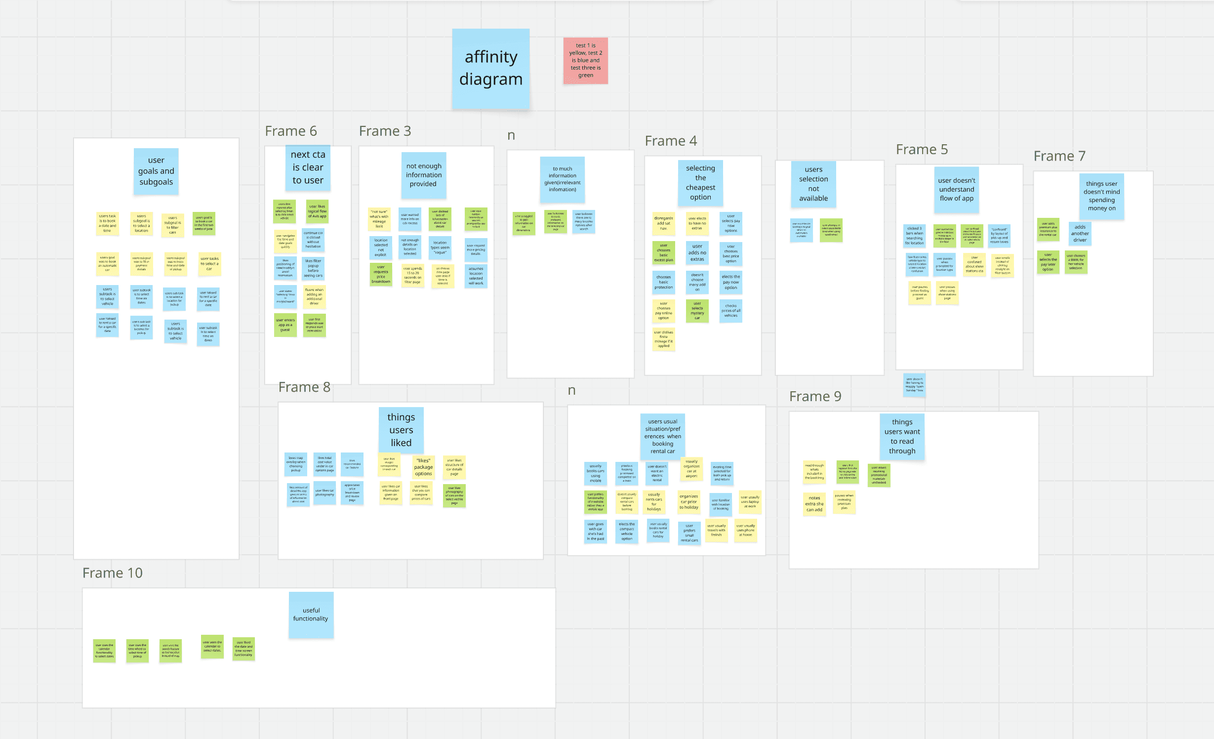
Taking Notes on usability tests
Focusing on user Goals, Pain points and Behaviours
Identifying Pain Points
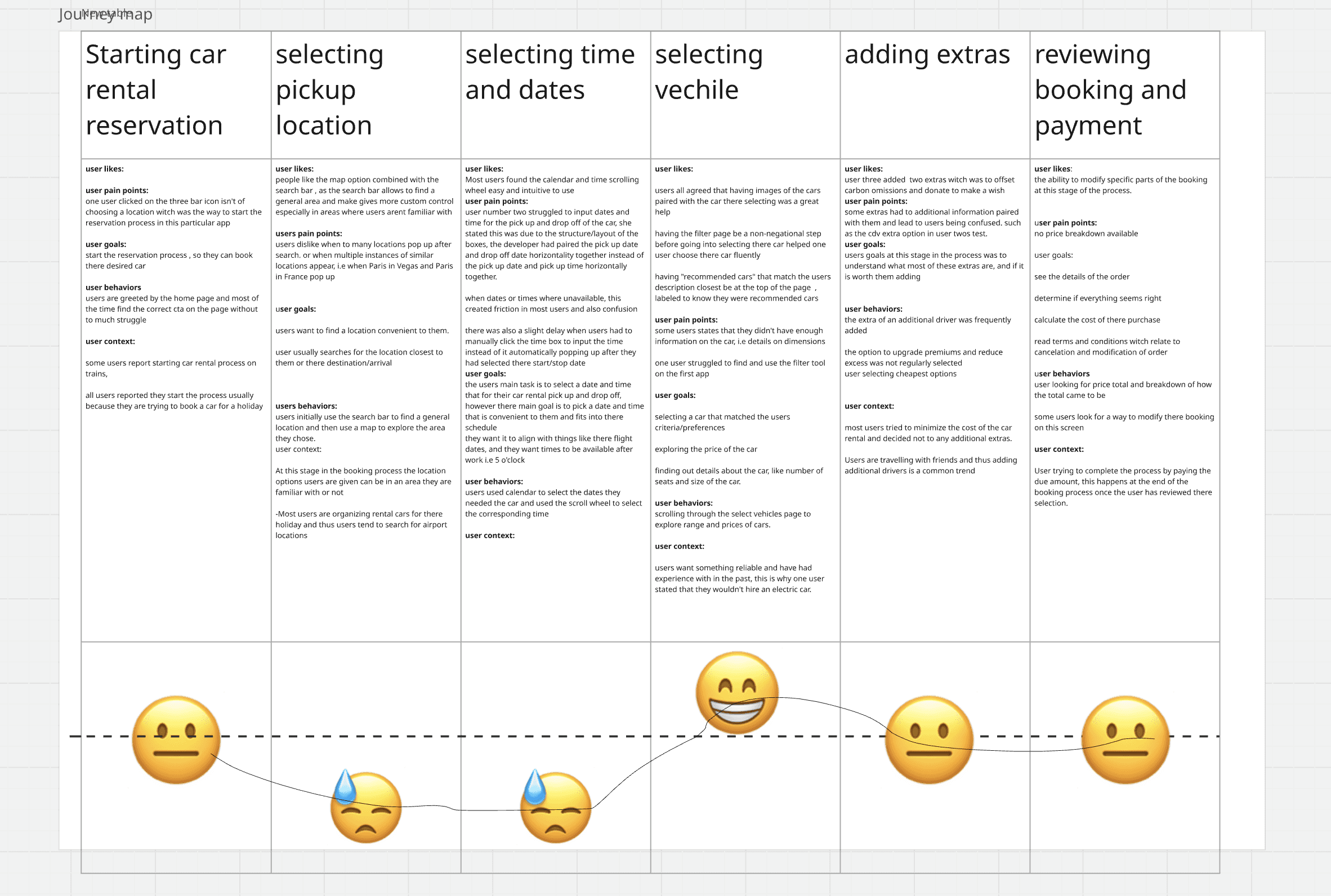
Mapping User expereince based on the amount of friction experienced at each stage of the app
Working on a solution
Creating an optimal worflow that minimizes confusion
Affinity Diagram
User Jounrney
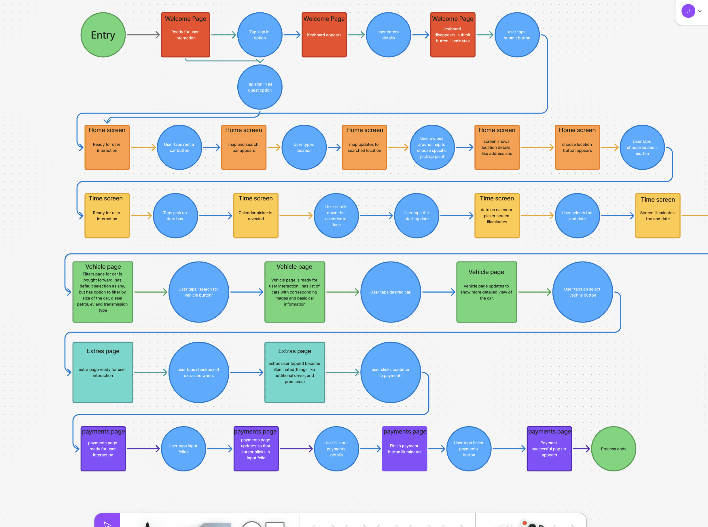
User Flow Diagram
Outcome
The Why
Increase CTA clickthrough
Better CTAs
Lets Grow!
Improved accessibility

Simplified Workflow
Predicted Conversion rate increase

Check Out the full Design Here